Project Description
After using their brand for over 60 years, it was time for a change. They asked us to rebrand their company to reflect the quality of their product and their service. With a strong reputation, word-of-mouth marketing and repeat business this business was still growing but their sights set to expand into the UK and European markets. Therefore they needed a brand that would compete internationally.
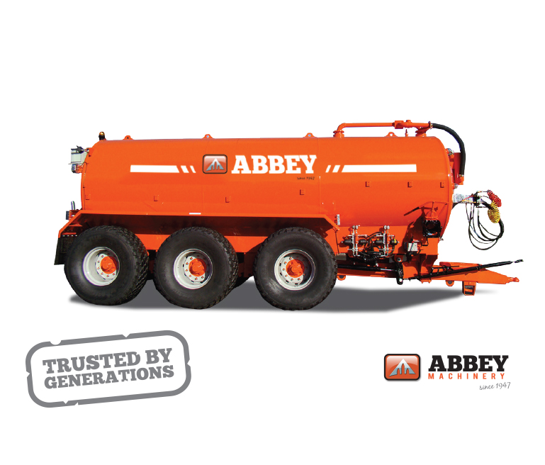
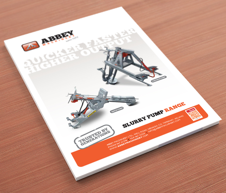
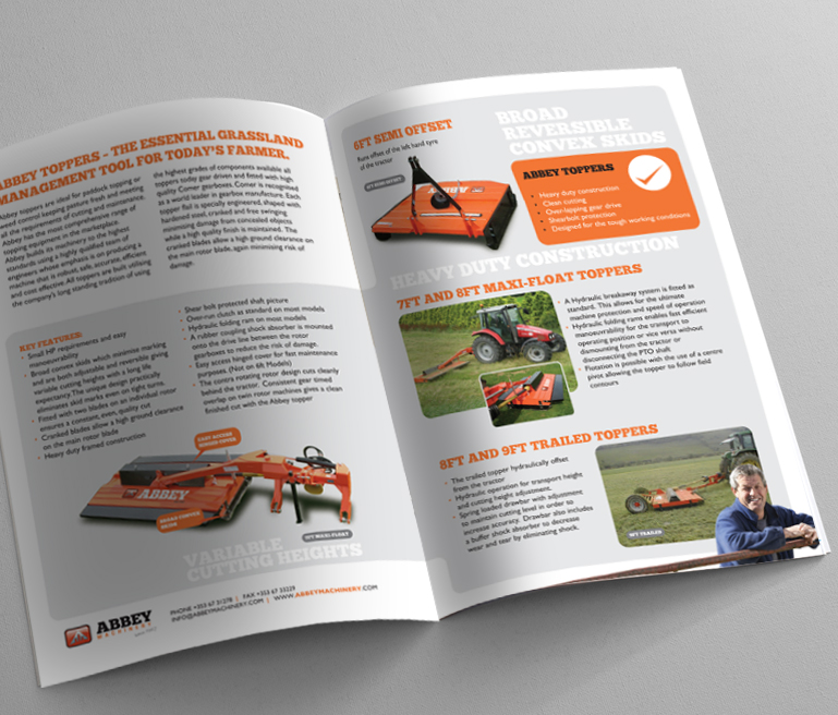
After completing a brand audit and brand values workshop, the strong family business values that had kept this business going, resurfaced. Not wanting to loose the heritage of the company we evolved the brand mark, incorporating the motif of the old Abbey in Nenagh, located beside their head office. We introduced a more contemporary slab typeface and a clean sophisticated design system. The brand colour palette was clean and vibrant – highlighting the dynamism of the company and it’s openness and pride in its product range. This new brand and design system was rolled out through all of their marketing collateral, from external signage on their building, to company product brochures, livery, advertising, sales tools and company presentations.
